White House(s)
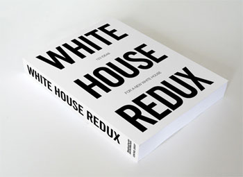
White House(s) is included in the White House Redux book and was shown in the 2008 exhibition at the Storefront for Art and Architecture in New York.
In April, 2008, NOArchitecture and Hermann Zschiegner participated in the “White House Redux” competition sponsored by the Storefront for Art and Architecture. This project was chosen for publication and exhibit. The brief was simple: What would the residence of the most powerful individual in the world, the White House in Washington, D.C., look like if it were designed today?
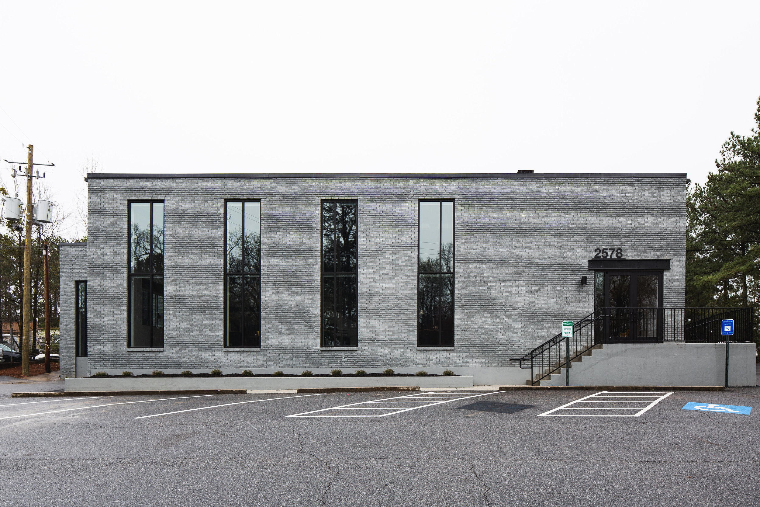
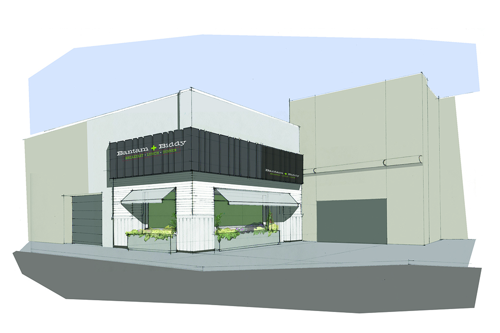
In a time and age where landmark buildings increasingly become targets for terrorist attacks, we propose the ultimate de-centralization of the White House while raising brand-recognition of this institution. Similar to ubiquitous brands like Starbucks, Nike or Apple and their retail outlets strategically positioned for maximum exposure, we envision a series of satellite White Houses, positioned over a neutral grid blanketing the entire country. Minimal in their design, the White House(s) are simple white boxes but are omnipresent throughout the country.
Every citizen will live in close proximity to at least one of the White Houses, just 50 miles, to assure increased accessibility to the Commander in Chief. Just text “white house(s)” and get the nearest location of one’s closest to you where you are.
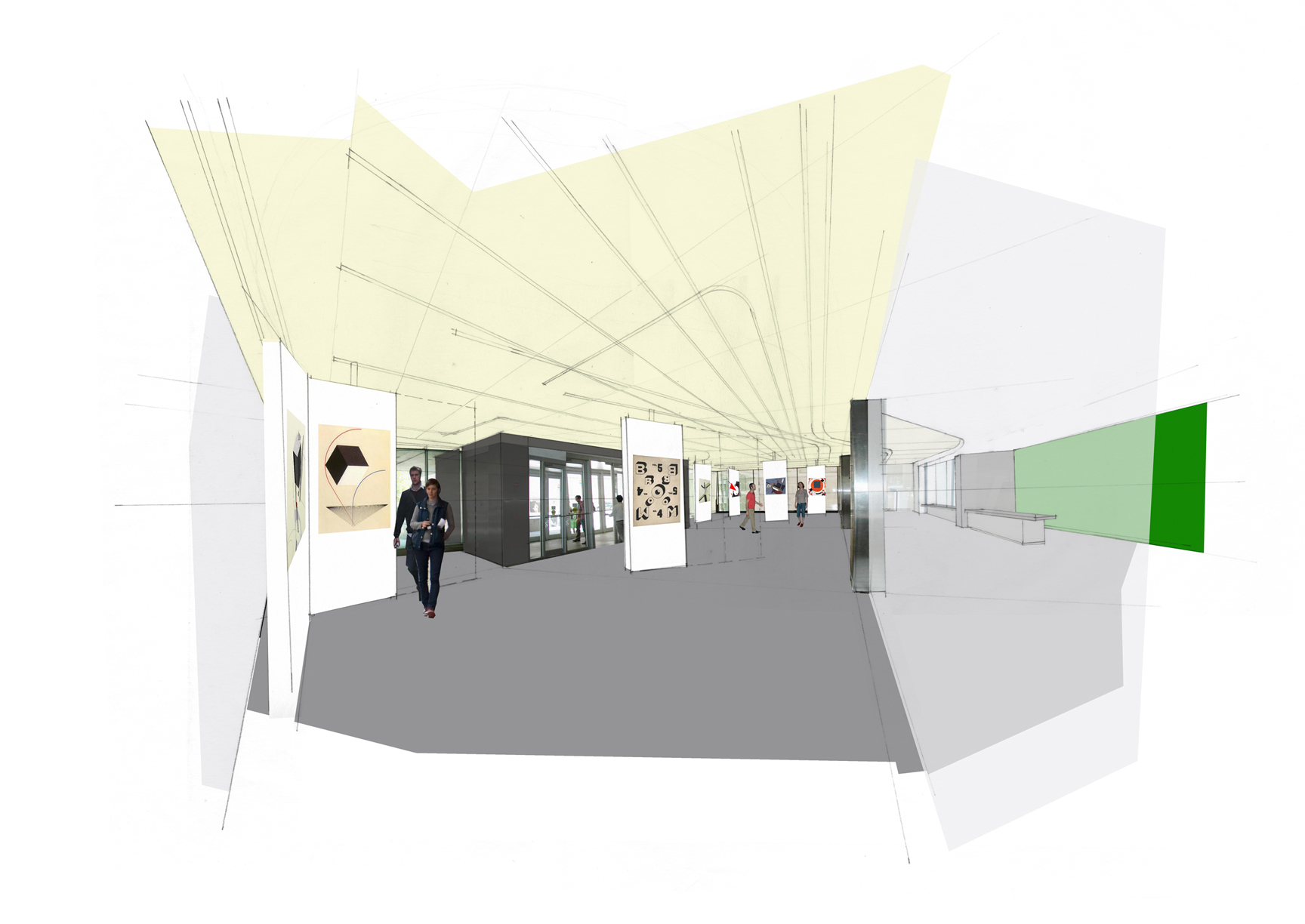
Much like the Greek Agora or the Viennese “Kaffehaus,” the multiple White House(s) become a place to gather information about the government (info‐kiosk), provide suggestions in a provided drop-box, meet fellow citizens, or (if present) actually meet the President of The United States.) (From high profile to low profile because) sometimes one just wants to get a cup of coffee and feel a part of this great nation. The White House(s) are a place where there is always a pot of hot coffee brewing with a paper cup of coffee or a White House(s) commemorative ceramic version will be available in the gift shop.

